Twitter: Product Design
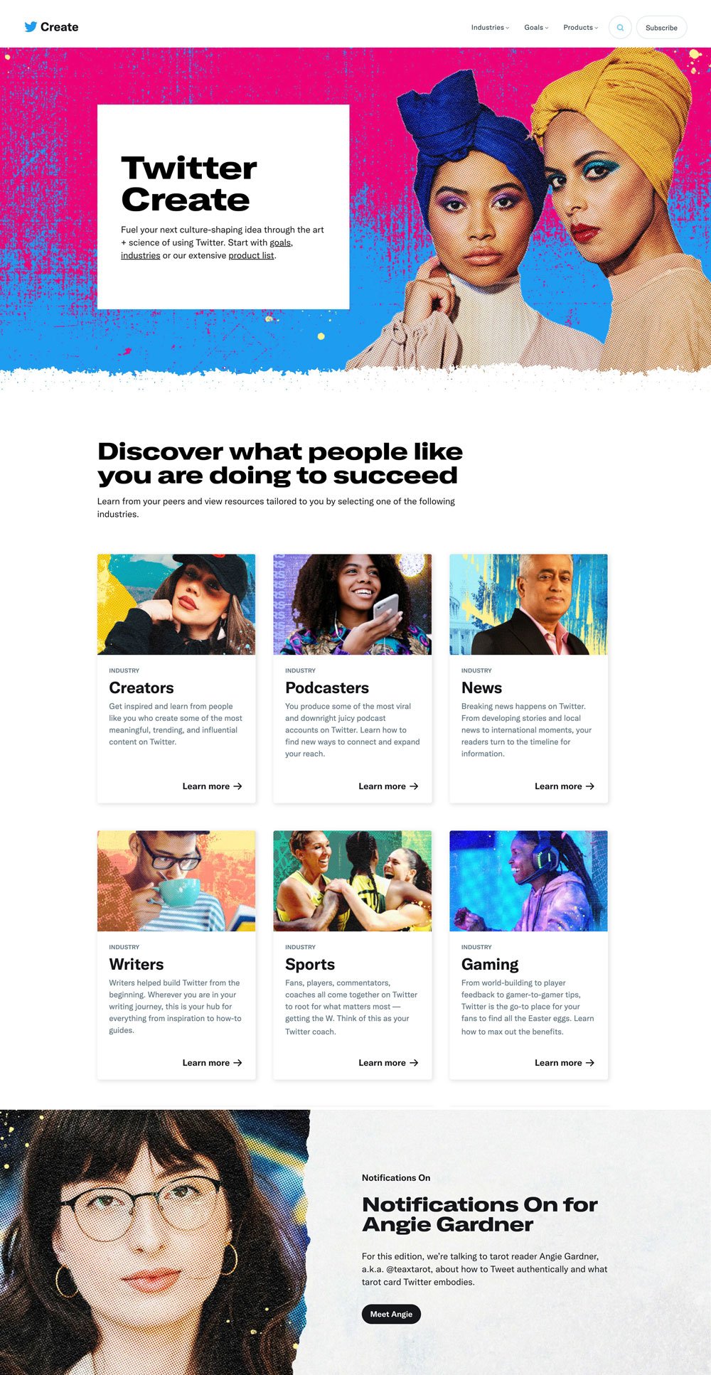
Building Beyond Boundaries
Redesigned and built a 200+ page web and mobile product—formerly media.twitter.com—for content creators. As lead technical designer, I bridged design and technology, configuring AEM components, streamlining workflows, and stress-testing designs to deliver top-quality results, pushing the boundaries of our technical framework with strategic, creative thinking.

Project Goals
Revamp site with improved UX, mobile design, and better performance.
Ensure final product matches proposed brand design and empower internal teams.
Use customer research to create mobile-focused components and architecture.
My Role
Partner with brand and marketing to wireframe the site with a mobile focus, starting from scratch.
Provide design system support and lead technical exploration and execution within the framework.
Build, test, and iterate with business and brand teams, focusing on mobile optimization and AEM templates for scalability.
Solve for the biggest problems first. Started with rethinking site architecture & focused on the top three user journeys. We involved business teams and engineering from the beginning to ensure an inclusive product process.
Phase 1: Prioritize


Know your vision and your limits. By leveraging design systems, accessibility practices, and our framework, we fired an agency lacking both vision and technical expertise and looked internally to build a super team. We then devised an aggressive but doable plan to migrate and redesign a 200 page website with 4 people. I partnered with brand to push our existing design system for bold, user-optimized results.
Phase 2: Achievable Vision


Phase 3: Refinement and Optimization
Design, build, test, iterate, and polish—repeat until launch. The team thrived on bold ideas and close collaboration, solving problems with smart solutions. Small details like edge treatments and content optimization gave us control and empowered business teams to take charge.

